Twitter Analysis (French)
We searched Twitter for all tweets that contained the words and word combinations listed in the taxonomy. Below are the main findings from this Twitter analysis, which include volume of tweets over time, top hashtags and topics tweeted about, links used and accounts mentioned.
Number of Tweets
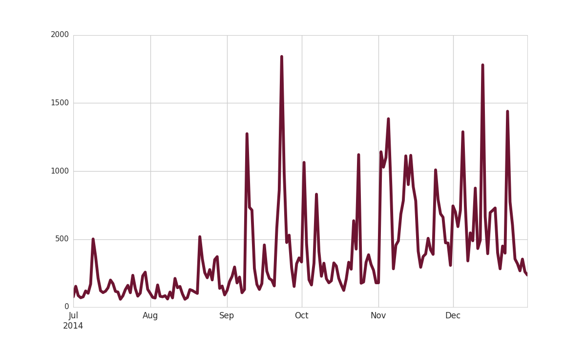
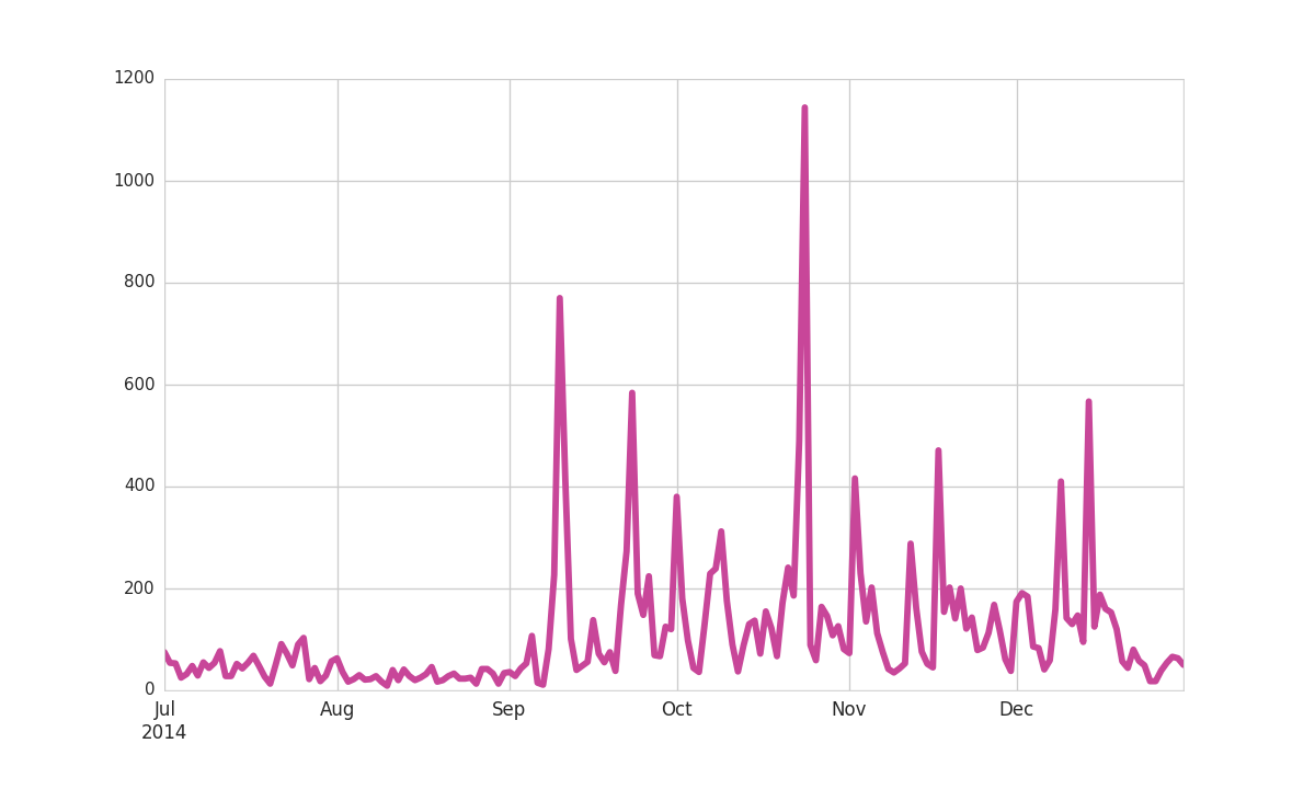
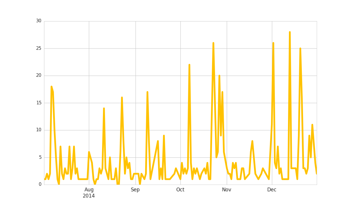
This graph shows the daily volume of tweets related to climate change.
Twitter is generally used less during weekends, so expect to see a weekly pattern with more tweets on weekdays.
Notice that as you hover over the plot, a toolbar appears at the lower left. This enables panning and zooming, and a button to reset the view once you've explored the plot.
Sentiment Over Time
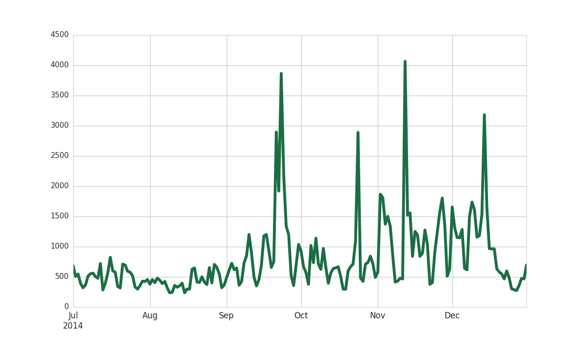
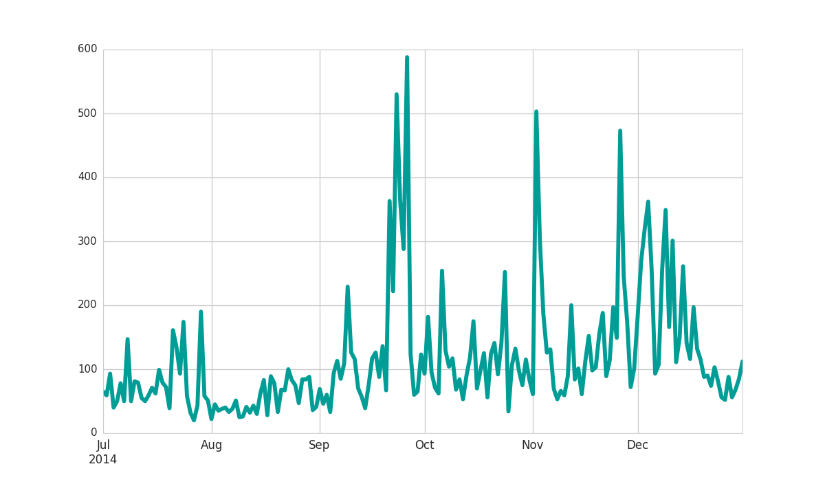
This graph shows the number of daily tweets with negative (green) and positive (blue) sentiment.
Notice that as you hover over the plot, a toolbar appears at the lower left. This enables panning and zooming, and a button to reset the view once you've explored the plot.
Number of Tweets by Topic
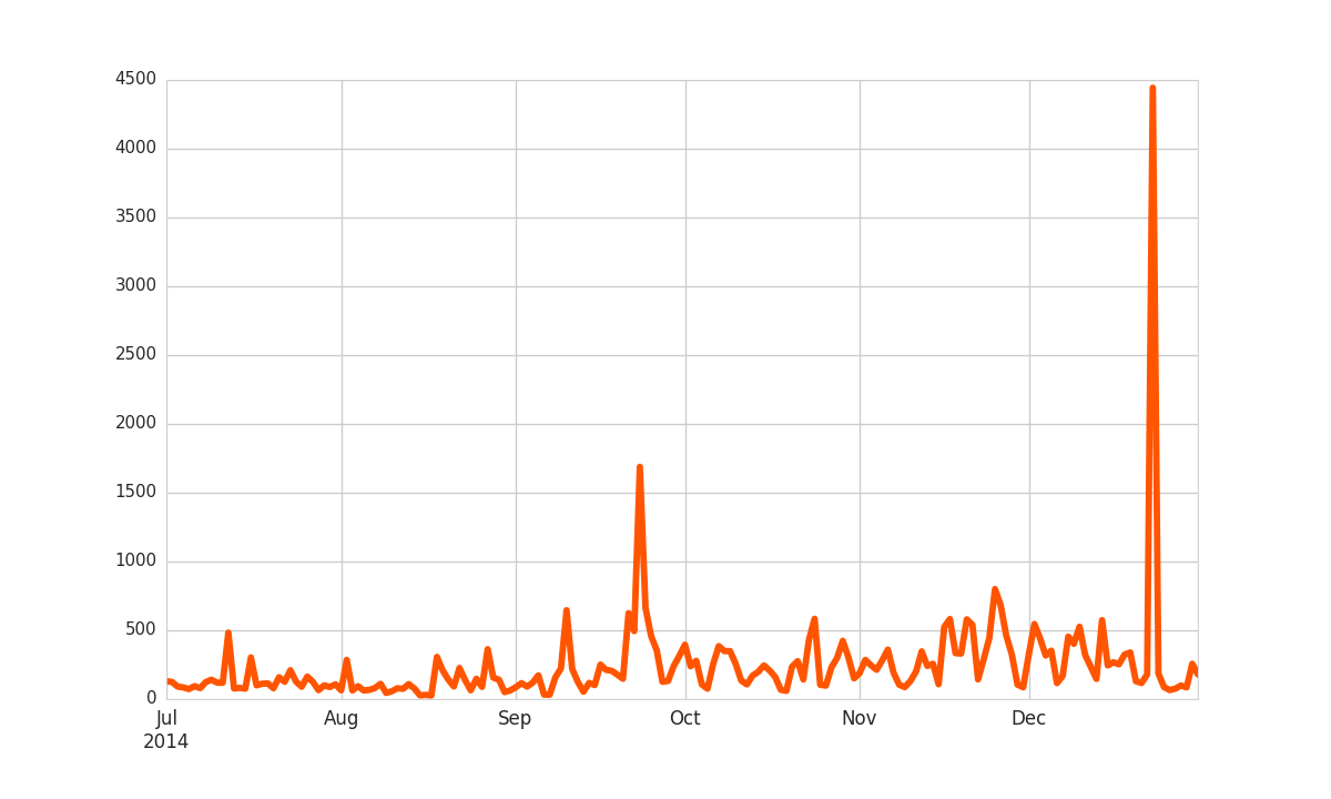
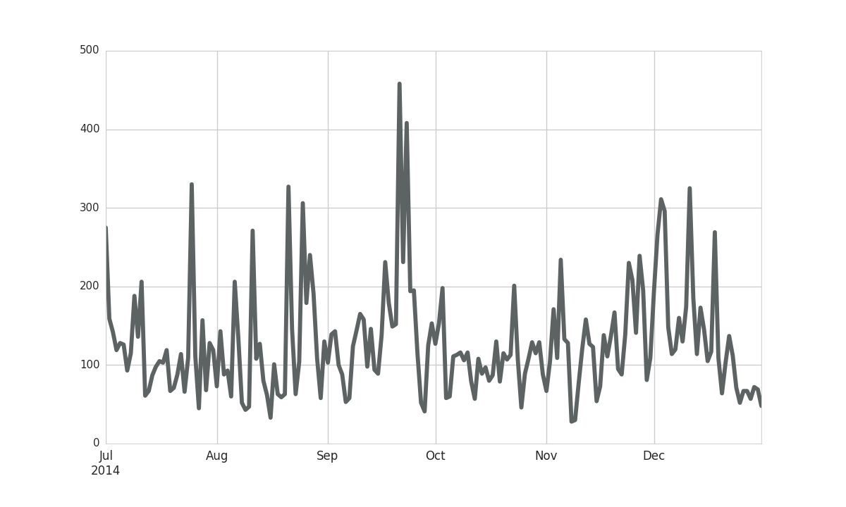
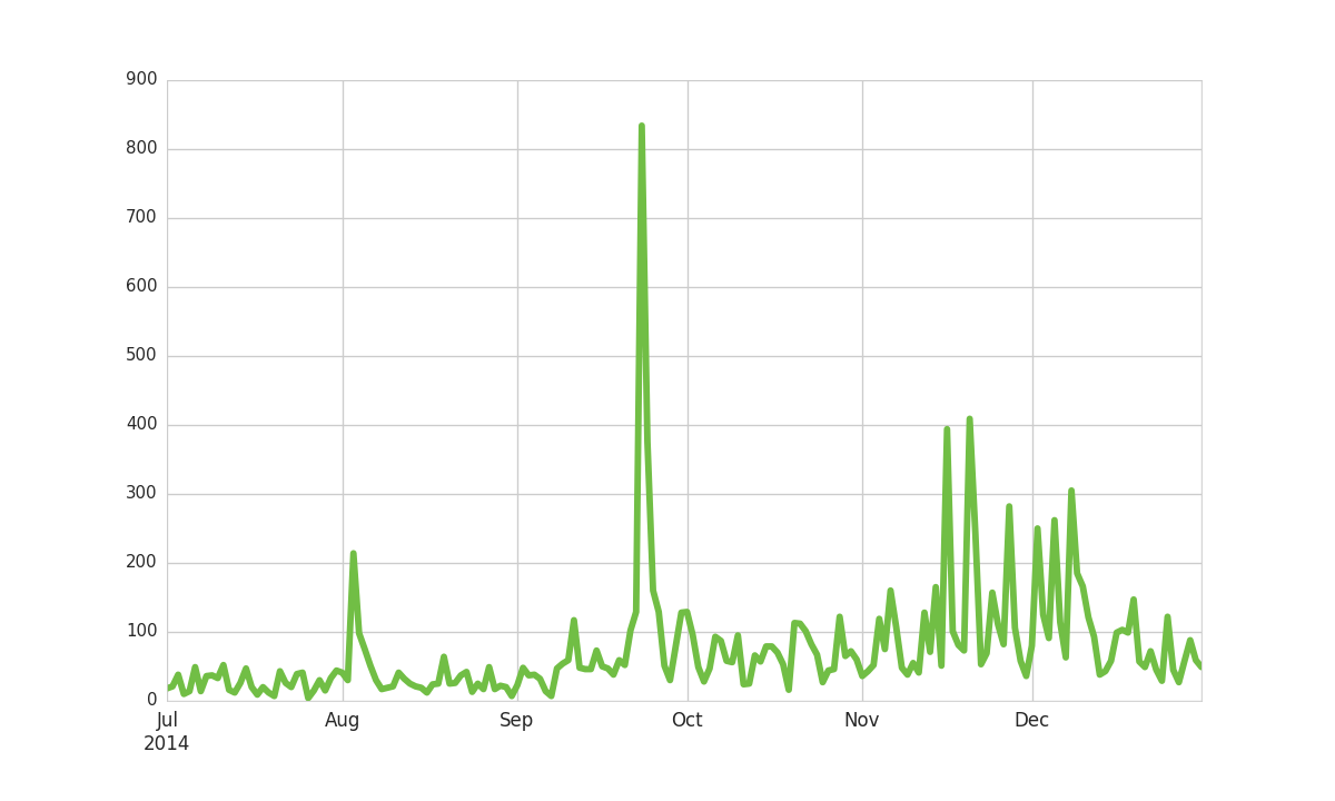
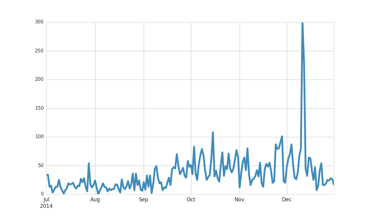
This graph shows the daily volume of tweets for each topic.
Twitter is generally used less during weekends, so expect to see a weekly pattern with more tweets on weekdays.
Notice that as you hover over the plot, a toolbar appears at the lower left. This enables panning and zooming, and a button to reset the view once you've explored the plot.
Top Hashtags
This graph shows which hashtags are used the most in tweets about climate change. Note that these hashtags are not necessarily listed in the taxonomy.
Click on bar to go to the hashtag on twitter.com
